by Lee Wayland | Jun 29, 2022
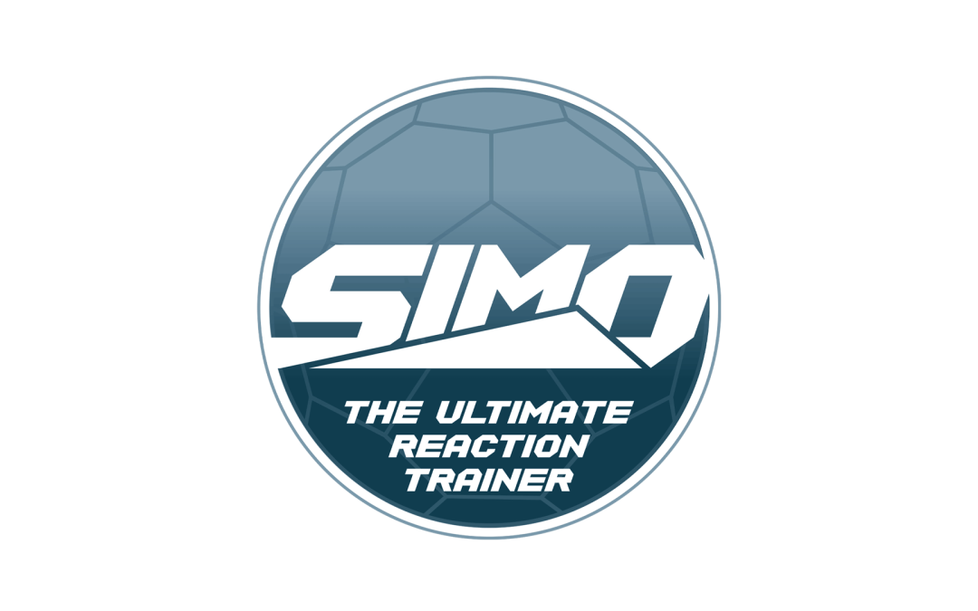
SSE SIMO Pro “It’s a game changer” Following on from the design of the SSE and SIMO Logos, Andrew developed a new product called SIMO Pro 1.0. LW design where instructed to turn the “post it note concept” drawing into a working logo. Using the...
by Lee Wayland | Jun 29, 2022
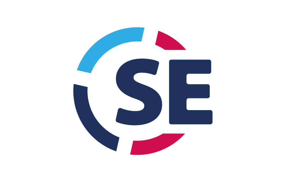
SE Energy “Surrey’s leading plumbing and heating service” LW design where commissioned SE Heating and Plumbing to help them rebrand. Keeping the existing colours, we reworked the logo to modernise the logo for the renewable energy market as well as traditional...
by Lee Wayland | Jun 29, 2022
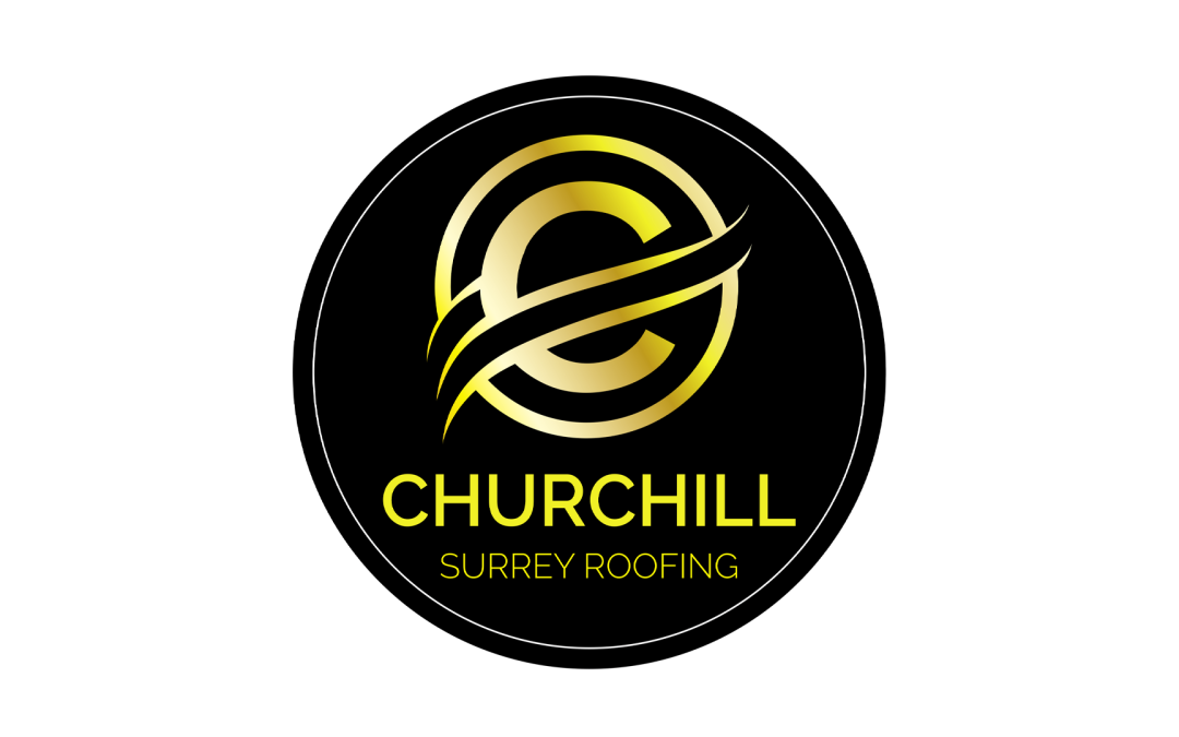
CHURCHILL SURREY ROOFING “Idea to Logo” Frazer requested a redesign of his original logo. We provided a number of concepts allowing the client to focus on an end result We created a 2 colour logo, with effects, along with the favicon. The logo works across the brand...
by Lee Wayland | Jun 28, 2022
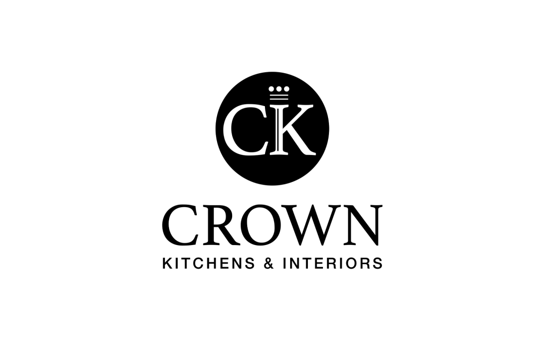
CROWN KITCHENS SURREY “Modernise our Logo” Our client had a very stong idea of the end result she wanted. However it still took a number of subtle design tweaks to get the logo to the sign off stage. We created a positive and negative version of the logo along with...